Your Quick Answer: Best Pillow Colors Ranked
| Color Category | Best Picks for 2025 | Mood Effect |
|---|---|---|
| Biophilic Greens | Sage, olive, eucalyptus, moss | Stress reduction, nature connection |
| Warm Earth Tones | Clay red, terracotta, rust, camel | Grounding, security, warmth |
| Jewel Tones | Emerald, cobalt blue, burgundy | Sophistication, energy, luxury |
| Warm Neutrals | Mushroom beige, warm taupe, smoky gray | Calm elegance, versatility |
| Muted Pastels | Dusty pink, soft lavender, powder blue | Gentle nurturing, relaxation |
The Science Behind Color Choices
Before diving into specific combinations, let's talk about why certain colors work. Research from the European Journal of Theoretical and Applied Sciences shows that interior color schemes significantly impact both the aesthetic quality of a room and the physical and emotional wellbeing of occupants.
Blue Tones (Navy, Cobalt, Dusty Blue)
Psychological Effect: Studies show blue reduces blood pressure and heart rate, promoting relaxation. It's the most universally calming color.
Best for: Living rooms, bedrooms, spaces where you unwind after work
Green Shades (Sage, Olive, Moss)
Biophilic Effect: Green creates measurable stress reduction through nature association. Houseplant sales surged 50% during 2020-2023, driving green décor popularity.
Best for: Home offices, family rooms, wellness-focused spaces
Yellow & Mustard Tones
Emotional Response: Color psychology research links yellow to happiness, optimism, and mental stimulation. It's literally sunshine in fabric form.
Best for: Kitchens, breakfast nooks, creative workspaces
Earth Tones (Terracotta, Rust, Clay)
Grounding Energy: Deep clay reds and terracotta provide stability and warmth, addressing collective needs for balance after years of uncertainty.
Best for: Cozy living rooms, reading nooks, fall/winter styling
What's Actually Trending in 2025
Forget what worked last year. 2025 interior trends show a clear shift toward earthy warmth, biophilic greens, and moody jewel tones. Here's what design professionals are actually specifying for cream couches right now.
Trend Alert: The Pinterest Data
Pinterest search data shows "earthy terracotta pillows" up 180% in Arizona markets, while "boucle green cushion" searches surged 150% in Northern California. Regional trends matter!
Translation: People are gravitating toward nature-inspired palettes that feel grounding and authentic, not cold and stark.
Top 5 Color Movements for Cream Couches
1. Biophilic Greens (Dominant Trend)
Sage, olive, eucalyptus, and moss greens continue their reign. Even as life normalizes post-pandemic, the biophilia effect endures with earthy greens complementing neutral furniture.
Why it works: Creates immediate nature connection, reduces stress, pairs beautifully with cream's warmth
2. Warm Earth Reds & Terracotta
Deep clay reds and terracotta are leading color predictions for 2025, offering warmth, groundedness, and nostalgic comfort.
Why it works: Warm tones create cozy atmosphere, connect to desert/natural landscapes, work year-round
3. Moody Jewel Tones
Dark chocolatey browns, vibrant burgundies, and shadowy olive greens create opulence and refined elegance against cream.
Why it works: Adds drama without overwhelming, feels luxurious, perfect for formal spaces
4. Warm Beige & Mushroom Neutrals
Moody neutrals like mushroom beige and warm taupe offer complexity without overpowering—unlike stark whites or cool grays of previous years.
Why it works: Adds depth while maintaining versatility, works with both modern and traditional aesthetics
5. Dusty Pastels (Refined Return)
Muted pastels like dusty pink and soft lavender bring warmth without feeling overly bright or feminine—more sophisticated than previous iterations.
Why it works: Introduces softness, creates modern romantic vibe, pairs well with brass accents
Decode Your Cream's Hidden Undertones (30-Second Test)
Not all cream couches are created equal. Your specific cream has undertones that dramatically affect which pillow colors look harmonious versus jarring. This simple test reveals everything.
The White Paper Test
Grab pure white printer paper. Hold it next to your cream couch in natural daylight. What do you see?
- Yellowish/Peachy: Warm undertones → Pair with coral, terracotta, sage, navy, mustard
- Grayish/Pinkish: Cool undertones → Pair with lavender, dusty blue, charcoal, emerald, blush
- Can't tell? Neutral undertones → You have maximum flexibility!
Warm Cream Strategy
Your cream has golden, yellow, or peachy undertones. Lean into warm colors for natural harmony.
Best colors: Coral, rust, sage green, camel, warm mustard, terracotta
Cool Cream Strategy
Your cream has gray, blue, or pink undertones. Choose cooler shades for sophisticated cohesion.
Best colors: Lavender, charcoal, emerald, dusty blue, blush pink, cool gray
4 Professional Designer Formulas
Stop guessing. These are the exact color ratios interior designers use to create magazine-worthy cream couch styling every single time.
Formula #1: The Garden Refresh (Most Popular 2025)
The Ratio: 60% Cream/White + 30% Sage Green + 10% Coral
Green is scientifically proven to be the most restful color for human eyes, while coral adds energizing warmth. This balances calm with vitality.
Perfect for: Coastal, modern organic, spring/summer styling, wellness-focused rooms
Formula #2: The Earthy Grounding
The Ratio: 60% Taupe/Cream + 30% Terracotta + 10% Deep Brown
Terracotta and clay reds are top 2025 predictions, providing stability and warmth. Brown creates feelings of comfort backed by color psychology.
Perfect for: Farmhouse, boho, southwestern, fall/winter, cozy family rooms
Formula #3: The Jewel Box Luxury
The Ratio: 60% Cream/Warm Gray + 30% Navy or Emerald + 10% Mustard Gold
Jewel tones dominate luxury interiors in 2025. Blue promotes calm while gold adds warmth—scientifically balanced for comfort.
Perfect for: Traditional, glam, eclectic, formal living rooms, dramatic statements
Formula #4: The Soft Romantic
The Ratio: 60% White/Cream + 30% Blush Pink + 10% Soft Lavender
Dusty pastels are resurging in 2025 but more muted and sophisticated. Pink symbolizes nurturing, lavender offers calming relaxation.
Perfect for: Bedrooms, reading nooks, feminine-but-modern aesthetics, spring styling
The 60-30-10 Rule Explained
This isn't arbitrary—it's based on visual balance principles used by designers globally. Here's why it works:
- 60% (Dominant): Creates cohesive foundation, prevents visual chaos
- 30% (Secondary): Adds interest without overwhelming the eye
- 10% (Accent): Creates focal points, allows personality to shine
17 Real Combinations (With Floral Examples)
Let's get specific. Each combination shows how to integrate floral throw pillows naturally while maintaining balance.
1. Cheerful Energy: Sunflower Yellow Pop
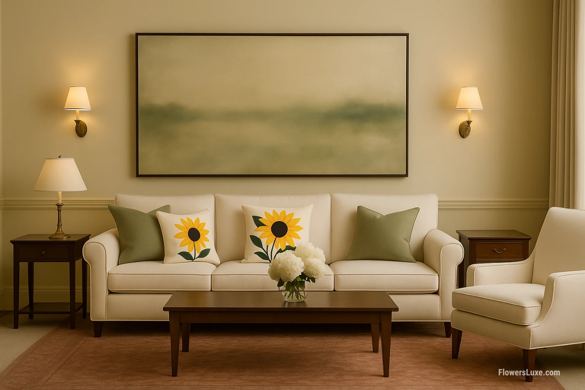
The Science: Yellow is proven to boost mood and mental activit , generating optimism and happiness. Against cream, it creates uplifting energy perfect for social spaces.
The Formula: 3 cream/white pillows + 2 yellow sunflower pillows + 1 soft gray accent
Pro tip: Keep 70% neutral when using bold florals to prevent visual overwhelm
2. Romantic Warmth: Coral Peony Blush
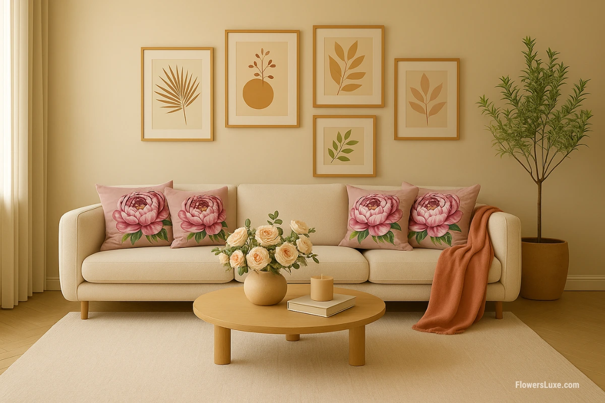
The Science: Pink tones symbolize compassion, warmth, and nurturing energy . The impasto texture adds tactile depth while maintaining softness.
The Formula: 3 cream pillows + 2 coral peony pillows + 1 dusty rose solid
Works with: Peonies symbolize romance and prosperity—perfect for bedrooms or romantic living spaces
3. Autumn Luxury: Terracotta Dahlia Drama
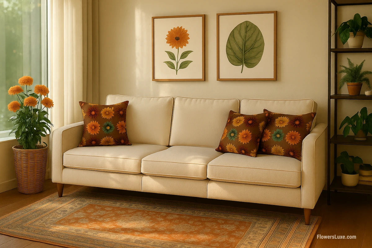
The Science: Terracotta and clay reds are explosive 2025 trends , offering grounding energy and warmth that feels both cozy and sophisticated.
The Formula: 3 taupe/cream pillows + 2 orange dahlia pillows + 1 chocolate brown velvet
Perfect timing: This combination shines in fall/winter but works year-round in southwestern or Mediterranean interiors
More Winning Combinations
4. Coastal Calm: Navy + White
Formula: 3 cream/white + 2 navy + 1 seafoam green
Blue's calming properties make it ideal for unwinding. Timeless nautical elegance.
5. Garden Fresh: Sage Green Botanical
Formula: 3 cream + 2 sage green + 1 soft white linen
Pair with lavender botanicals for layered garden vibes
6. Jewel Statement: Emerald + Gold
Formula: 3 cream + 2 emerald green + 1 mustard gold
Luxury meets nature. Works with green orchid impasto pillows
7. Sunset Warmth: Rust + Camel
Formula: 3 cream + 2 rust orange + 1 camel brown
Earthy sophistication. Terracotta searches up in 2025
8. Modern Zen: Charcoal + Blush
Formula: 3 cream + 2 charcoal gray + 1 blush pink
Sophisticated balance. Gray + pink trending for gray couches too
9. Cottage Romance: Lavender Dreams
Formula: 3 white/cream + 2 soft lavender + 1 purple accent
Lavender bouquet pillows create dreamy spa vibes
Quick Reference: Combinations 10-17
Seasonal Rotation Strategy
Smart styling means adapting to seasons without breaking the bank. Here's the professional approach that keeps your cream couch fresh year-round.
The Anchor + Accent Method
Professional stagers use this budget-friendly trick:
- Keep 2-3 neutral "anchor" pillows year-round (cream, taupe, warm gray)
- Swap only 2-3 seasonal "accent" pillows every 3-6 months
- Add one seasonal throw blanket for extra color without pillow investment
- Total cost per season: $60-100 vs. $200-300 for full replacement
Spring/Summer Palette
- Coral & Peach: Energizing warmth for entertaining
- Soft Blues: Cooling effect for hot days
- Sage Green: Fresh botanical vibes, trending heavily 2025
- Sunny Yellow: Cheerful energy spaces
Best florals: Watercolor tulips, cherry blossoms, light botanical prints
Fall/Winter Palette
- Rust & Terracotta: Earthy warmth, are 2025’s trending colors, bringing cozy.
- Deep Burgundy: Sophisticated drama
- Mustard Gold: Rich without heaviness
- Chocolate Brown: Timeless cozy elegance
Best florals: Autumn dahlias, vintage roses, rich impasto textures
Styling Floral Pillows on Cream Couches
Floral pillows add personality and nature-inspired beauty to cream furniture—but there's a right way to do it. Here's how to avoid the "grandma's house" look while embracing botanicals.
The 70-30 Floral Rule
When using bold floral patterns, keep 70% of your other pillows neutral/solid. This prevents visual chaos while letting statement pieces shine.
Example: 3 neutral pillows + 2 bold floral pillows = balanced, professional look
Best Floral Styles for Cream Couches
Watercolor Botanicals
Soft, dreamy florals with muted colors create serene aesthetics. Watercolor tulips and sweet pea patterns work beautifully.
Best with: Modern, minimalist, Scandinavian, spring/summer styling
Impasto & Textured Florals
Raised, painterly textures add tactile dimension. Impasto peonies, dahlias , and sunflowers create art-like statements.
Best with: Contemporary, eclectic, art-focused interiors, all seasons
Vintage & Romantic Florals
"Grandma's florals" are trending for 2025 —vintage rose prints and faded chintz with nostalgic charm. Modern execution prevents dated look.
Best with: Cottagecore, traditional, English country, romantic bedrooms
Modern Botanical Illustrations
Crisp, scientific-style botanical drawings feel fresh and sophisticated. Lavender illustrations and anthurium prints work brilliantly.
Best with: Modern organic, educational spaces, biophilic design
Flower Symbolism Guide
Beyond aesthetics, different florals carry meanings that can enhance your room's emotional atmosphere. Here's how to choose intentionally:
8 Mistakes Ruining Your Cream Couch Style
After fixing hundreds of pillow disasters, I keep seeing the same errors. Here's how to avoid them and nail the designer look immediately.
❌ Mistake #1: All Neutral Everything
The Problem: All cream/beige/white pillows that completely disappear into the couch, creating flat, boring spaces.
✅ The Fix: Add at least ONE medium-contrast color. Research shows color significantly impacts room satisfaction . Even soft coral or dusty blue makes huge difference.
❌ Mistake #2: Matching Everything Perfectly
The Problem: All pillows from same collection create sterile "furniture showroom" vibes.
✅ The Fix: Pinterest data shows mixed, eclectic looks dominate 2025 preferences. Mix collections while maintaining color palette cohesion.
❌ Mistake #3: Wrong Size Proportions
The Problem: Tiny 16" pillows on massive sectionals or oversized 24" pillows drowning small loveseats.
✅ The Fix: Standard 3-seat couches need 20-22" pillows. Large sectionals handle up to 24". Always vary sizes: 2 large + 2-3 medium + 1-2 small.
❌ Mistake #4: Ignoring Texture Completely
The Problem: All same-fabric pillows (usually cotton) create flat, one-dimensional looks lacking depth.
✅ The Fix: Velvet, boucle, and rich textures dominate 2025 trends. Mix linen, velvet, faux fur, knits, impasto. Texture = visual interest even with similar colors.
❌ Mistake #5: Not Considering the Whole Room
The Problem: Choosing pillow colors that clash with existing wall art, rugs, curtains, or wood tones.
✅ The Fix: Take room photos on your phone. Use free design apps to test pillow colors digitally before purchasing. Consider overall room color harmony.
❌ Mistake #6: Following Trends Blindly
The Problem: Buying "trendy" colors that don't match your aesthetic or lifestyle needs.
✅ The Fix: Use trends as inspiration, not rules. Choose colors based on psychological effects that support your lifestyle—calm blues for relaxation, energizing yellows for activity spaces.
❌ Mistake #7: Too Many Competing Patterns
The Problem: Multiple bold patterns fighting for attention create visual exhaustion and chaos.
✅ The Fix: Use the 70-30 rule: 70% solids/subtle textures + 30% patterns. If using multiple patterns, vary scale dramatically (large floral + tiny geometric).
❌ Mistake #8: Analysis Paralysis
The Problem: Overthinking prevents action. Your cream couch stays boring for months.
✅ The Fix: Start with ONE formula from this guide. Pillows are easily changed—experiment! You can always adjust. Action beats perfection.
Frequently Asked Questions
What are the best pillow colors for a cream couch in 2025?
Based on 2025 design trends , the best colors include biophilic greens (sage, olive, eucalyptus), warm earth tones (terracotta, clay red, camel), jewel tones (emerald, cobalt blue, burgundy), and warm neutrals (mushroom beige, warm taupe). These align with current psychological needs for grounding and comfort while maintaining sophistication.
How many pillows should I put on a cream couch?
For standard 3-seat cream couches, use 5 pillows in varied sizes (2 large 22", 2 medium 20", 1 small accent 16-18"). For large sectionals, 7-9 pillows work best. Always use odd numbers for visual balance. This creates professional-looking depth and dimension without overwhelming the seating area.
What psychological effects do different pillow colors have?
Research published in environmental psychology journals shows blue reduces blood pressure and promotes calm, green decreases stress through biophilic effects, yellow boosts optimism and energy, while warm earth tones create feelings of security and grounding. Choose colors based on your room's intended mood and function.
Should I match pillow colors to my cream couch's undertones?
Yes, matching temperature creates cohesive looks. Hold white paper next to your couch: if it looks yellowish, it has warm undertones (pair with coral, terracotta, sage, navy). If it looks grayish or pinkish, it has cool undertones (pair with lavender, dusty blue, charcoal, emerald). This 30-second test guides all color decisions for harmonious results.
What's the 60-30-10 rule for styling cream couches?
The professional designer formula: 60% neutral pillows (cream, beige, taupe), 30% secondary color (like sage green or dusty blue), 10% bold accent color (coral, mustard, or navy). This ratio creates balanced, non-overwhelming visual interest. It's used by interior designers globally because it prevents visual chaos while allowing personality to shine through accent colors.
How do I style floral pillows on a cream couch?
Keep 70% of pillows neutral when using bold florals to prevent visual overwhelm. Choose watercolor botanicals, impasto textures, or vintage rose patterns. Mix one statement floral with 2-3 solid coordinating colors. This lets the pattern shine without creating chaos. Consider flower symbolism to enhance emotional atmosphere.
Should I change pillow colors seasonally?
Yes, but smartly using the anchor + accent method. Keep 2-3 neutral anchor pillows year-round and swap only 2-3 seasonal accent pillows every 3-6 months. Spring/Summer: fresh coral, sage, soft blue, sunny yellow. Fall/Winter: rust, burgundy, mustard, chocolate. This keeps costs around $60-100 per season instead of $200-300 for full replacement while keeping your space fresh.
Can I mix different pillow textures on a cream couch?
Absolutely essential! . Mix linen, velvet, faux fur, knitted fabrics, impasto florals, and woven materials. This creates layered, sophisticated looks even with similar colors. Aim for 2-3 different textures maximum to maintain elegance without overwhelming the space.
Continue Your Styling Journey
Complete Cream Sofa Color Guide
Comprehensive guide with 12+ examples and professional arrangement techniques
Gray Couch Pillow Pairings
Master modern gray furniture styling with perfect color combinations
Leather Couch Pillow Guide
Special techniques for styling leather furniture with textures and colors
Navy Blue Couch Styling
Transform navy furniture with sophisticated color pairings
Transform Your Cream Couch Today
You now have the complete toolkit: color psychology research, 2025 trend data, proven designer formulas, and 17 real combinations. Styling cream couches isn't about rigid rules—it's understanding principles and adapting them to your unique space.
and emotional wellbeing. Your pillow choices matter more than you think—they set the mood for every moment spent in your living space.
Start with one formula that resonates with your lifestyle. Test it. Adjust as needed. Remember: pillows are the easiest décor to change, so experiment confidently. The best combinations are the ones that make you smile every time you walk into the room.